Knockout Canine Brand Identity
Role: Brand Designer
Deliverables:
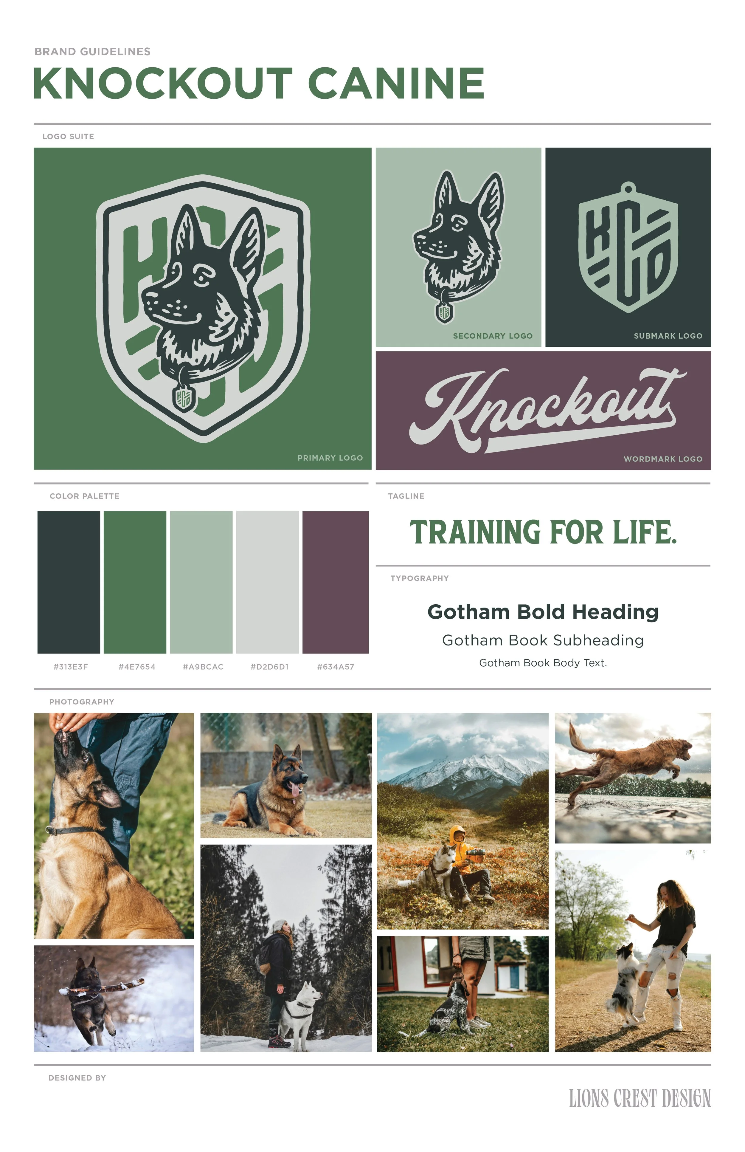
Logo suite and mark system
Typography and color palette
Tagline development
Photography and application direction
Final brand guidelines
CASE STUDY
Overview
Knockout Canine is a professional dog training business founded by Kacey, a formally educated dog trainer with real-world experience working with high-drive and working breeds. In addition to running her training practice, Kacey works as a corrections officer—bringing a calm, disciplined, and highly situational awareness–driven mindset to her work with dogs.
The objective of this project was to design a complete visual identity that reflected credibility, authority, and long-term professionalism—without leaning into the aggressive, macho tropes that dominate much of the dog training industry.
This was a full brand identity engagement, focused on creating a system that could scale with the business as Kacey works toward training full-time.
PROJECT OVERVIEW
1. THE CHALLENGE
Category Insight
Dog training branding tends to fall into two predictable extremes:
Overly casual and generic, associated with entry-level obedience or big-box training programs
Overly aggressive and performative, relying on “alpha” aesthetics that prioritize intimidation over trust
Positioning Intent
Knockout Canine needed to sit in a more intentional middle ground—appealing to clients who are serious about behavior and training, whether that’s household obedience, public behavior, or working-dog applications like hunting, search, or protection.
Key Brand Messages
Formal education and professional credibility
Calm authority and control, not dominance
Tactical competence without aggression
A training philosophy rooted in long-term success and the dog’s well-being
2. MOODBOARDING
The project began with a focused review of existing brands and logos operating in adjacent spaces—particularly outdoor, working-dog, and athletic brands with established credibility. This research phase helped identify common visual patterns, gaps, and overused tropes within the category.
From that analysis, I narrowed the exploration to two distinct creative directions and developed moodboards to present to the client. These boards were used intentionally as a decision-making tool—not as inspiration alone, but as a way to evaluate which direction best aligned with the brand’s goals, and which paths should be ruled out early.
This step helped define the brand’s position early on: serious but not intimidating, authoritative without being macho, and professional without feeling corporate. With a clear direction established, the visual language could then be explored with purpose and consistency, rather than guesswork or excessive iteration.
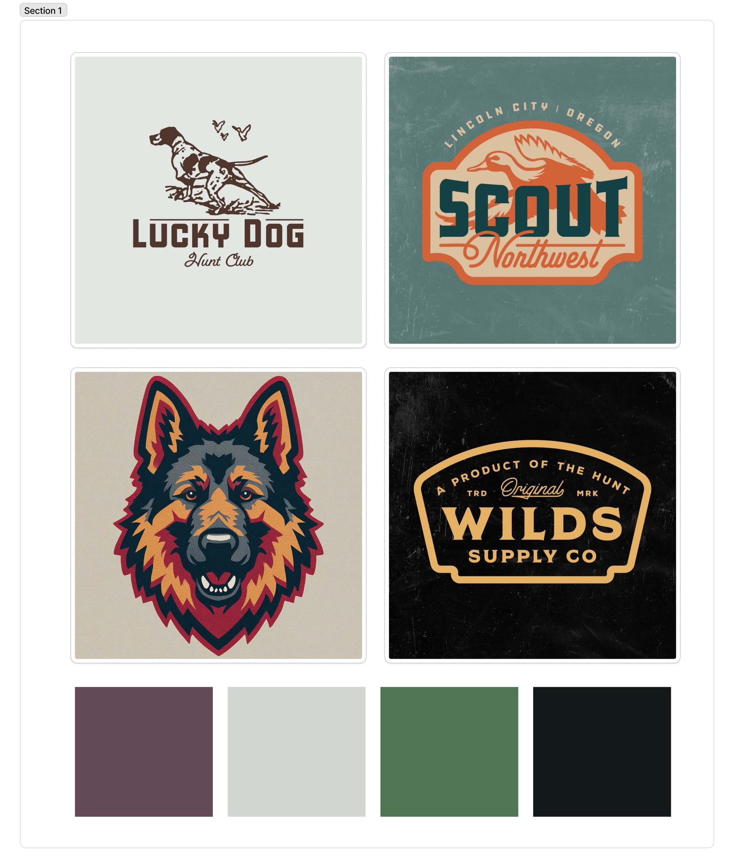
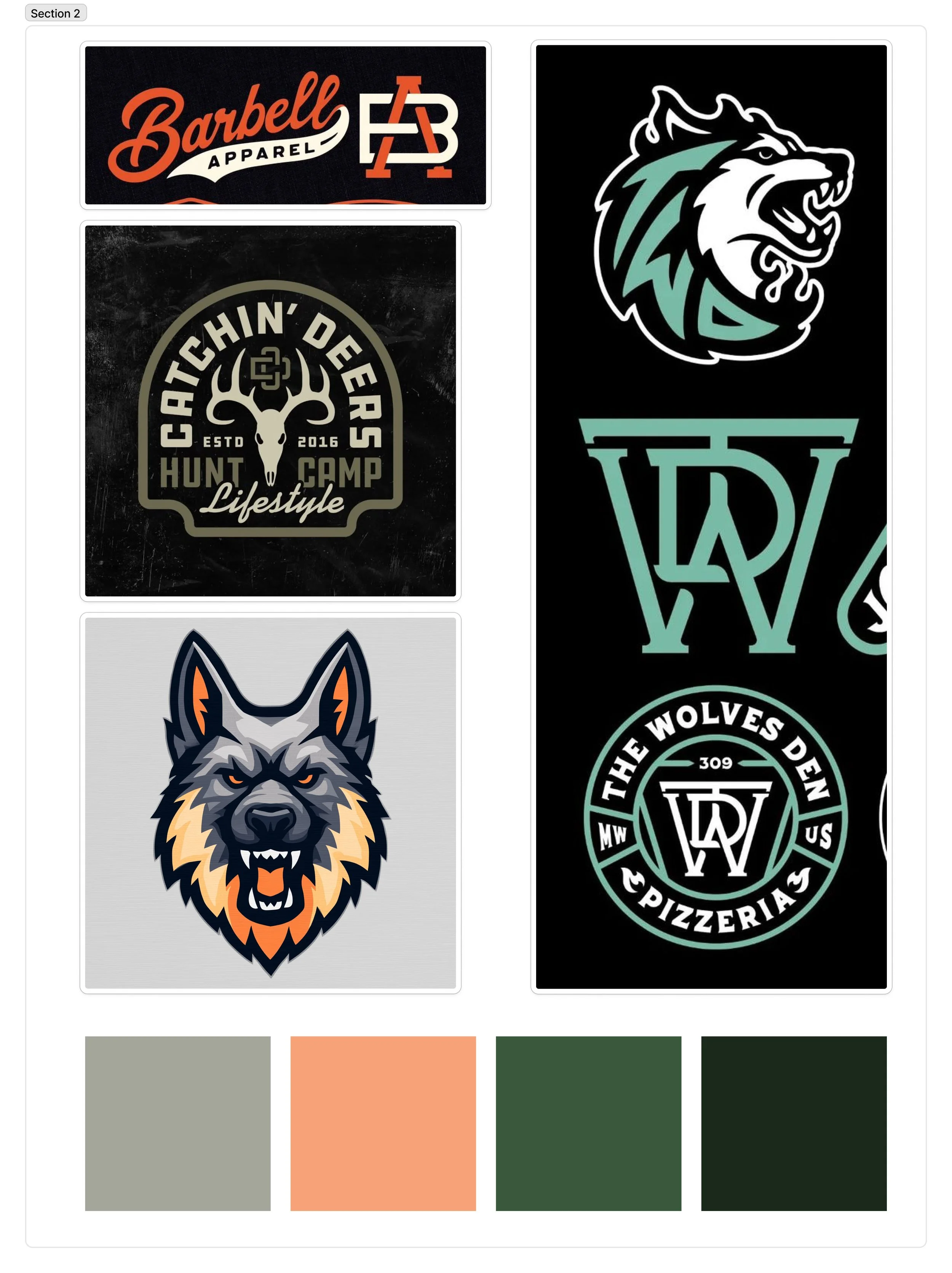
Moodboards explored:
Outdoor and working-dog heritage references
Athletic, utilitarian branding systems
Bold animal iconography without exaggerated aggression
Natural, grounded color palettes rooted in real environments
3. IDEATION.
Thumbnails & Sketching
With a clear direction established, sketching began as a way to explore form, balance, and modularity within the chosen visual lane.
Initial sketches focused on:
Shield and badge structures to convey trust, protection, and legitimacy
Proportions that felt stable and grounded rather than aggressive
Modular shapes that could evolve into submarks and apparel-ready icons
Wordmark explorations that balanced strength with approachability
These sketches were deliberately iterative and exploratory, prioritizing structure and silhouette before refinement. By grounding this phase in an established direction, the exploration stayed focused and efficient—allowing strong forms to emerge naturally rather than forcing novelty.
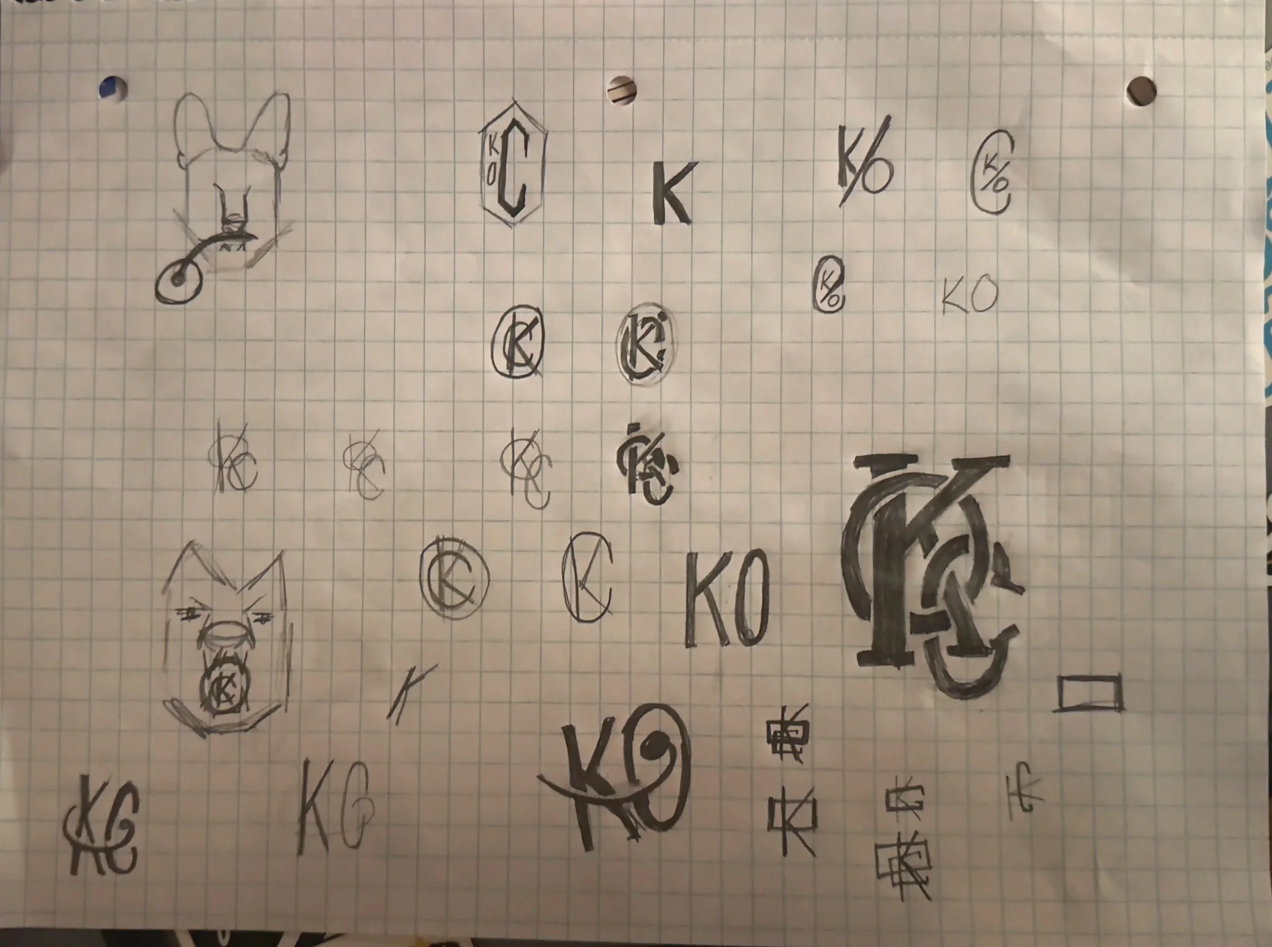
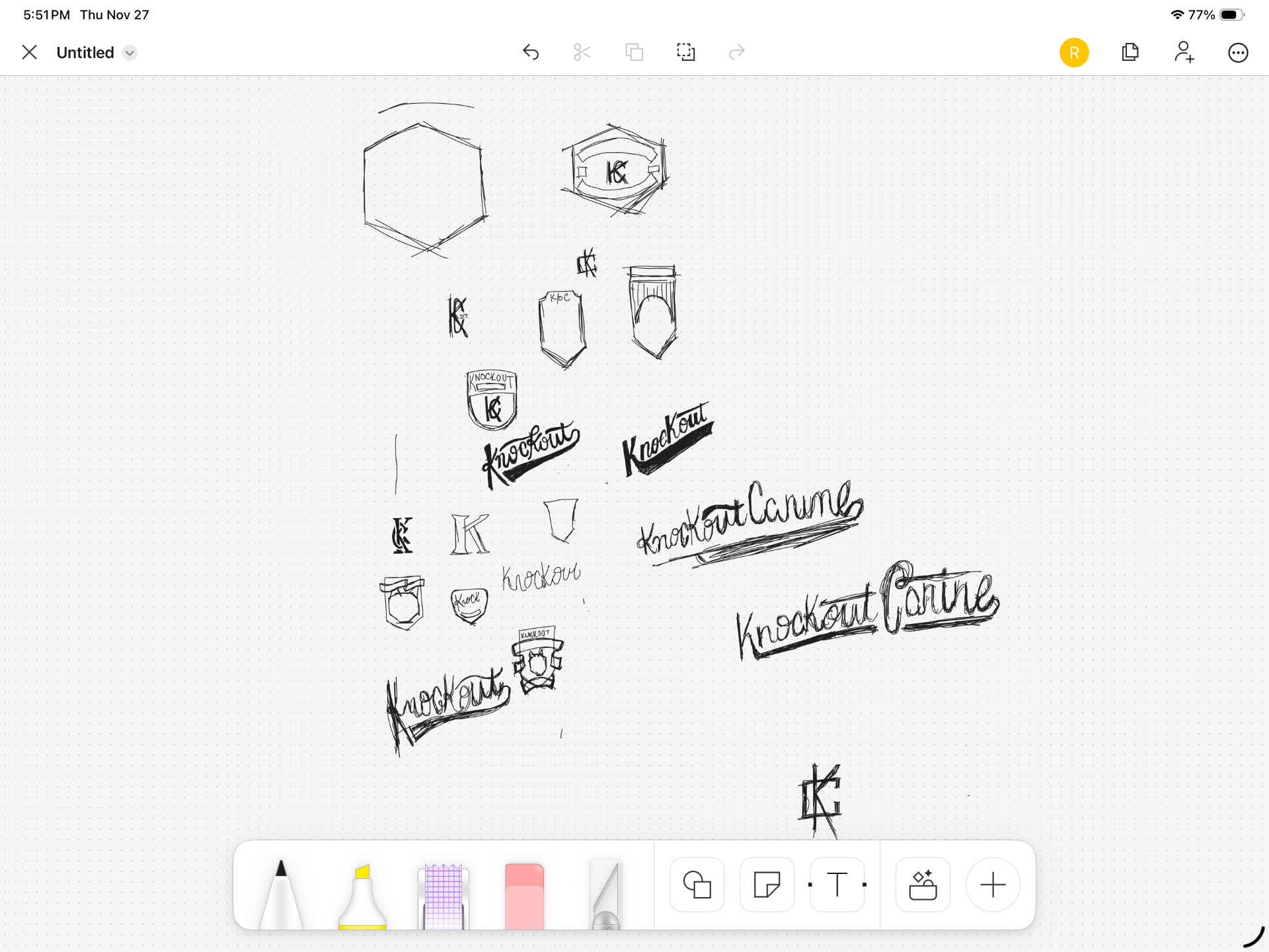
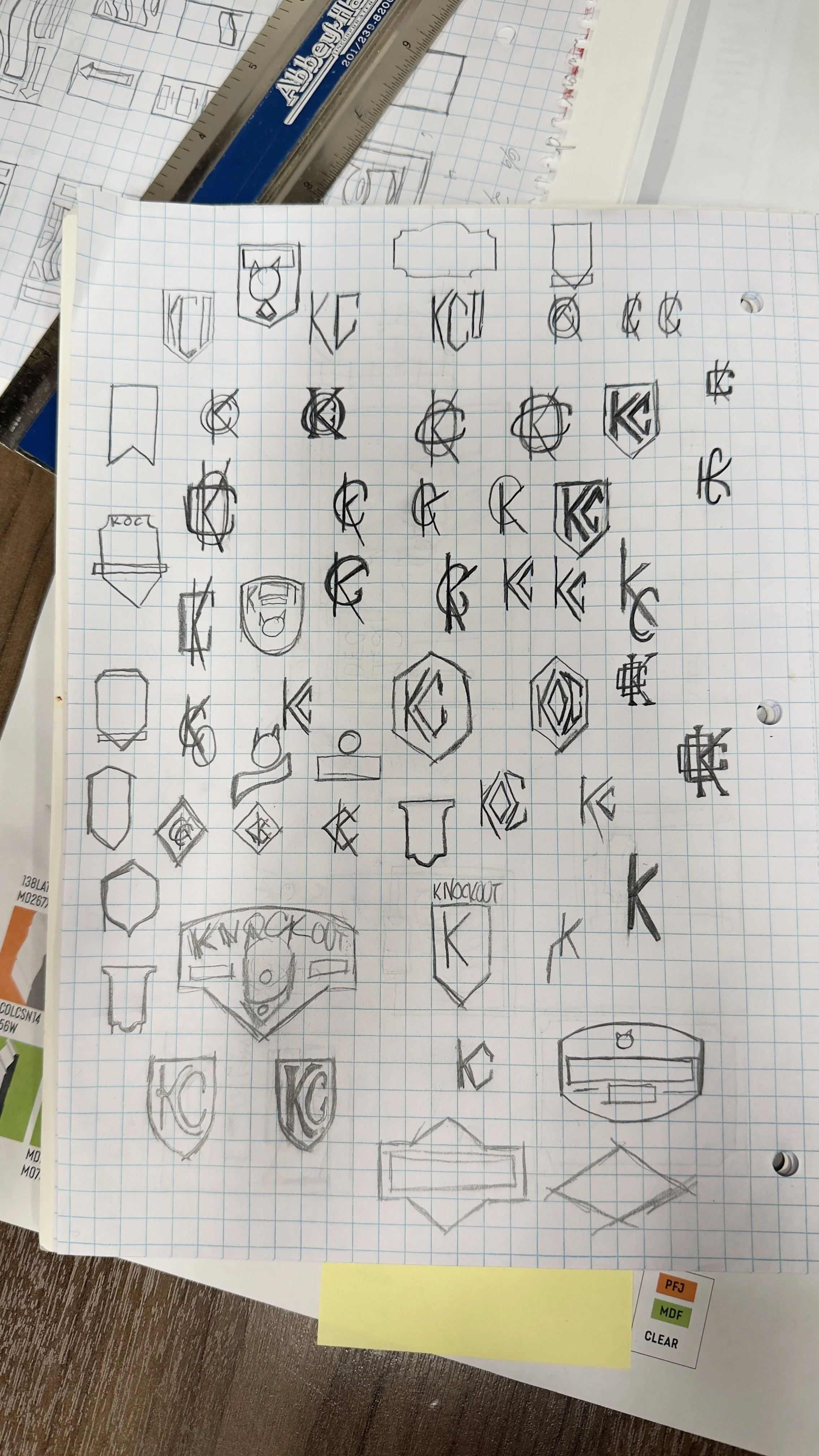
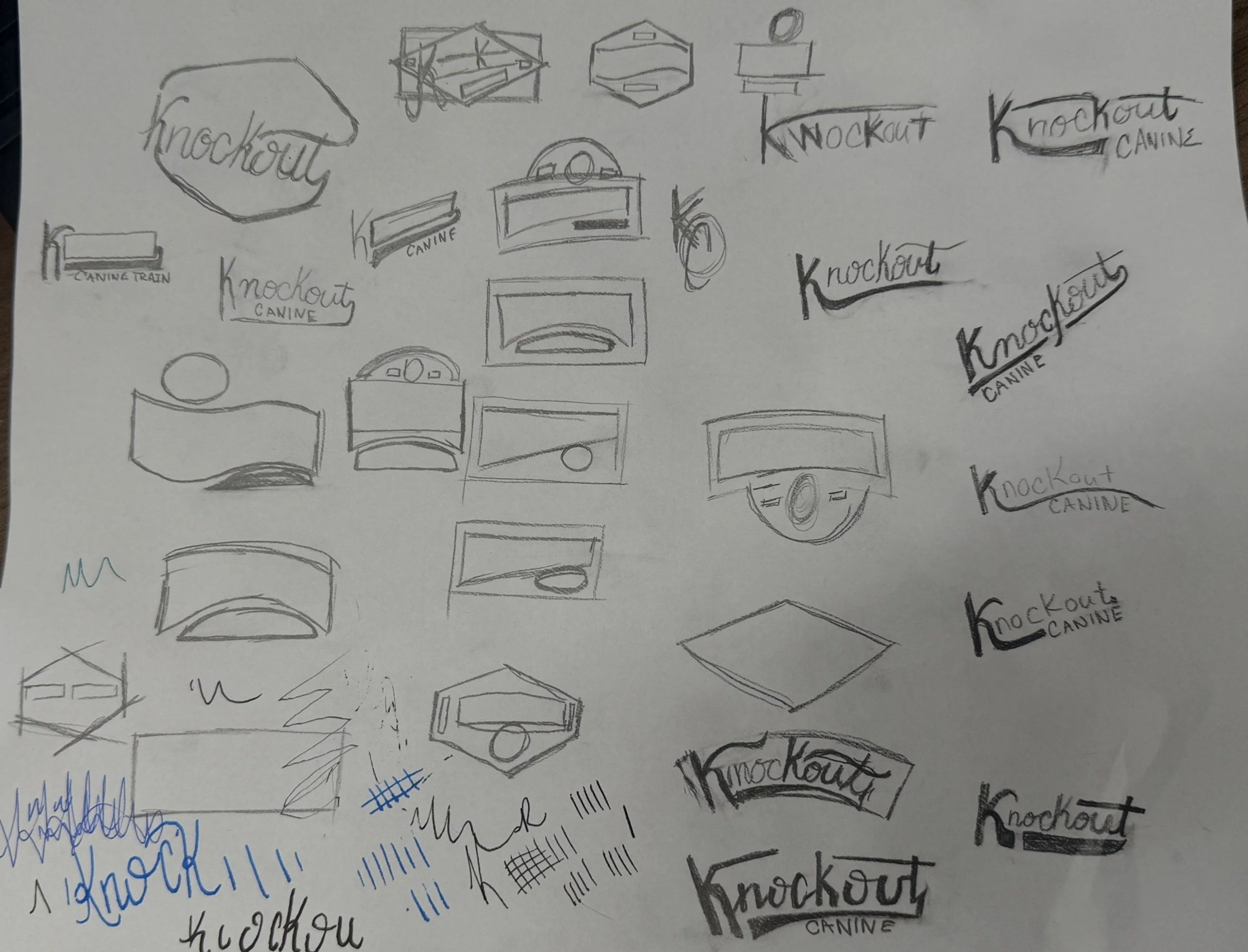
“An ugly sketch is a sign of a great idea.”
4. REFINEMENT
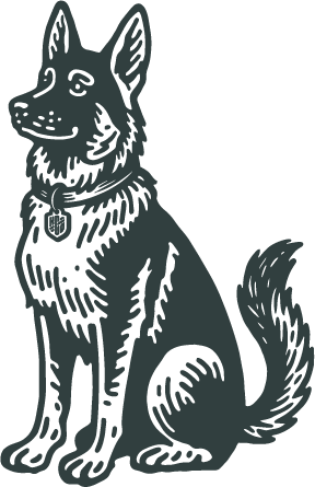
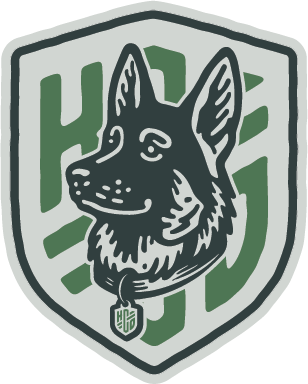
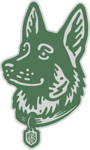
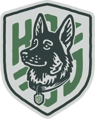
Logo Development
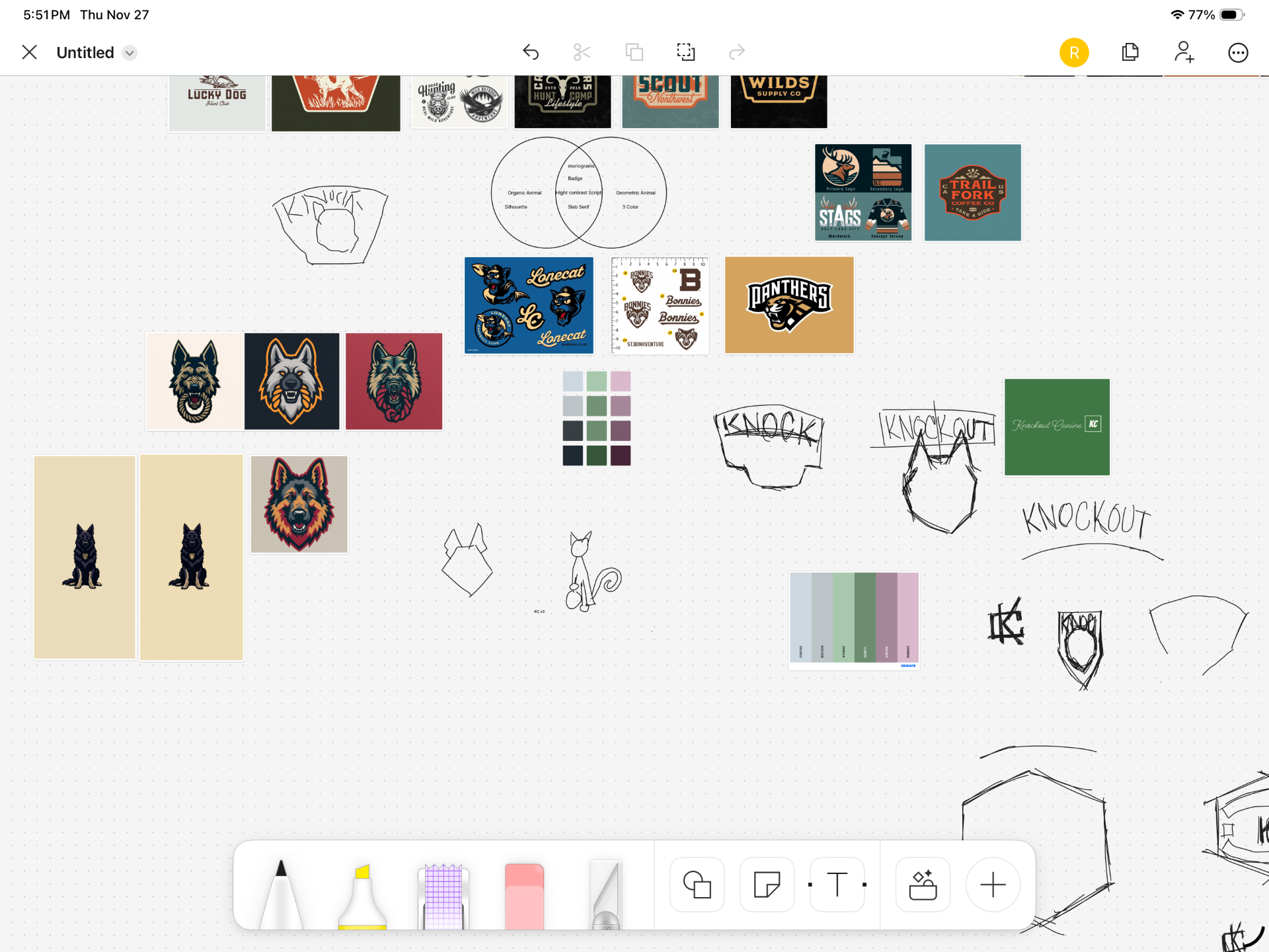
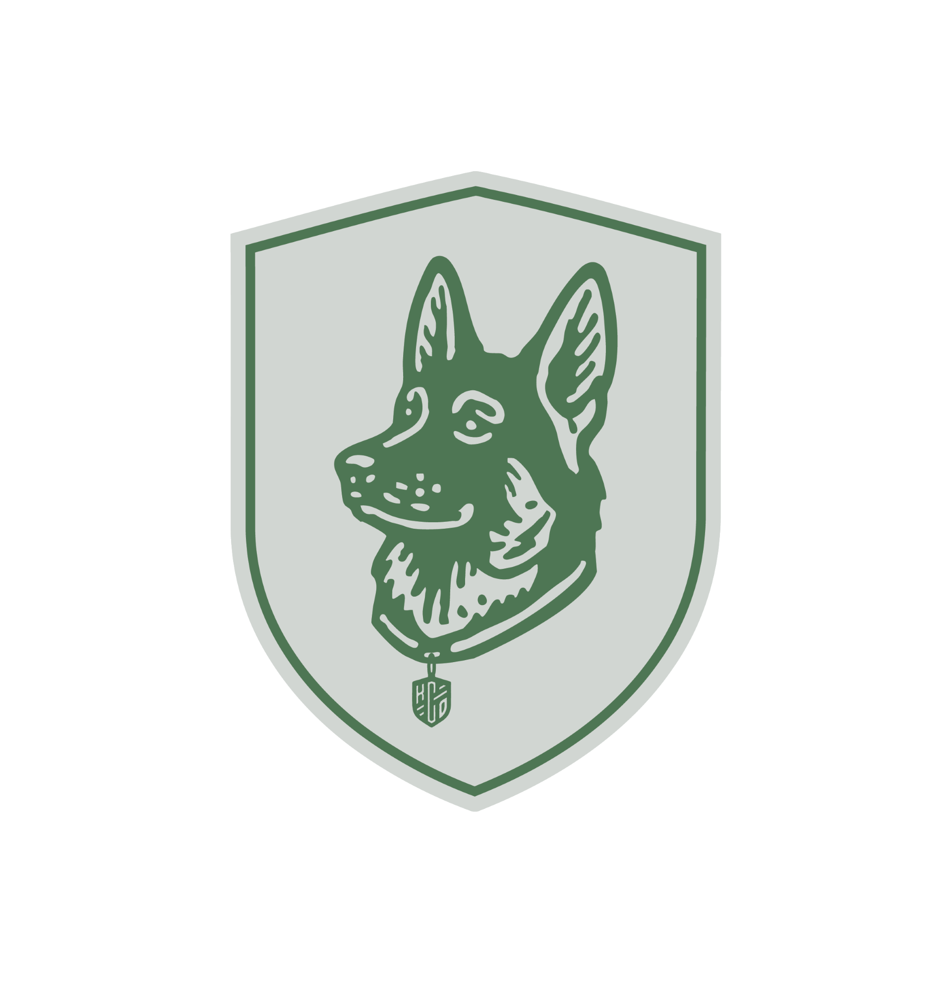
Two concepts were selected from the initial drafts to move into focused refinement. Both centered on a crest featuring a German Shepherd—an intentional choice that reflects Kacey’s preferred breeds and the working-dog lineage associated with reliability, discipline, and capability.
Rather than designing a single, static logo, the identity was developed as a flexible logo system built to perform across real-world applications. The system includes:
A primary crest for brand-forward and foundational use
A simplified canine mark optimized for small-scale applications
Submark and monogram variations for apparel, patches, and digital use
A bold wordmark designed to stand alone when illustration is not appropriate
Each element was evaluated for legibility, balance, and consistency across sizes, formats, and environments—ensuring the identity remains cohesive and functional whether applied to apparel, print, or digital touchpoints.
5. Type & Tag
Type
Typography choices were driven by legibility, neutrality, and authority. Gotham was selected for its clean structure and professional tone—supporting a brand voice that is confident without being loud.
The type system reinforces Kacey’s training philosophy:
Clear communication
Consistent structure
No unnecessary embellishment
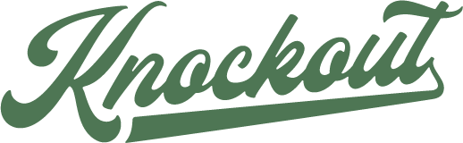
Tagline
Training for Life.
The tagline was developed to intentionally carry dual meaning:
Training as a lifelong commitment
Training for real-world life—not just controlled environments
It reinforces Knockout Canine’s focus on sustainable behavior, not quick fixes.
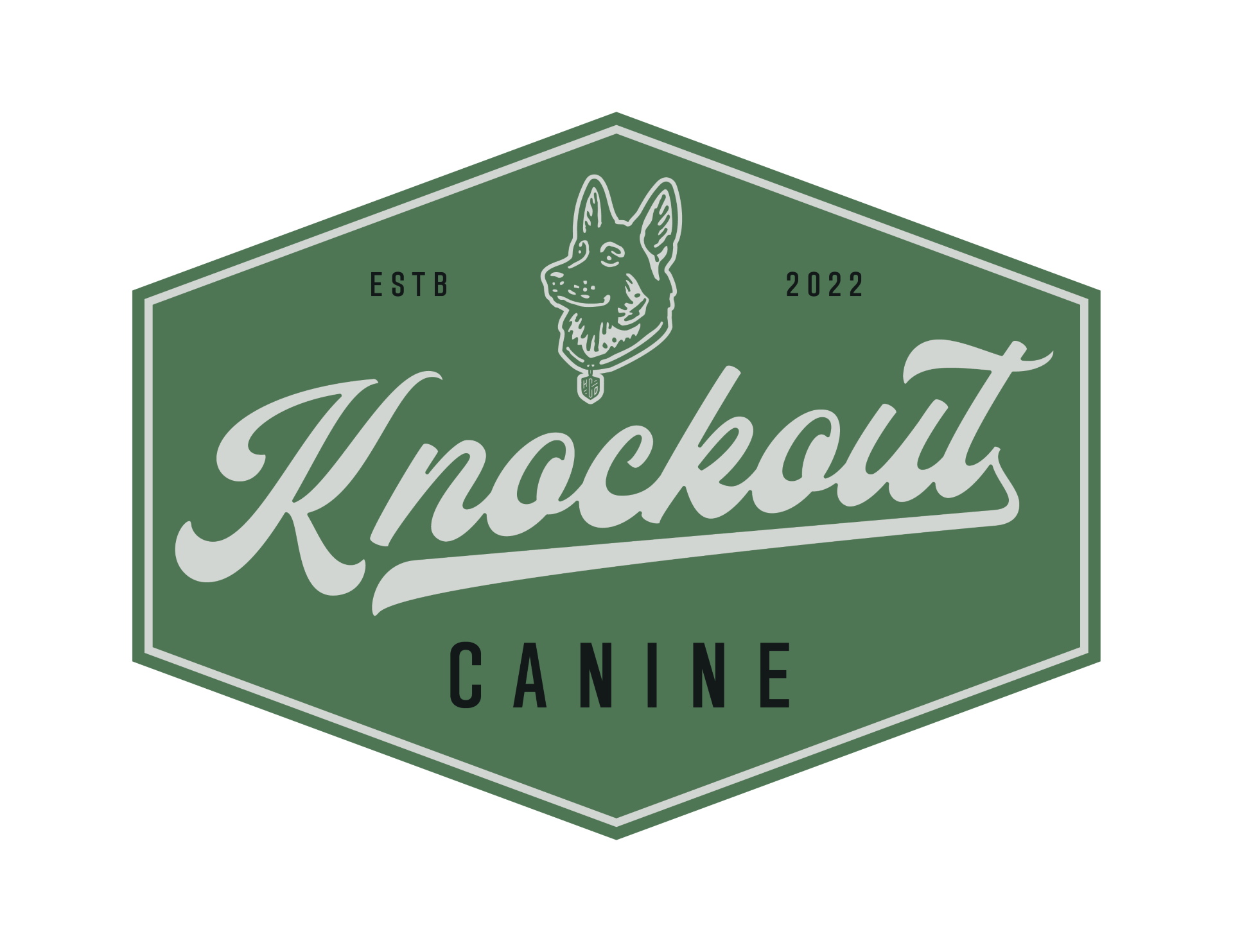
6. Color Palette
Color & Application
The color palette pulls from muted greens, neutrals, and grounded earth tones—referencing outdoor environments while maintaining a modern, professional finish.
These colors were tested across:
Apparel concepts
Digital & Print
Visual Accessibility
The goal was consistency and longevity, not trend-driven impact.
The final identity positions Knockout Canine as a credible, professional training brand for clients who take behavior seriously. The system balances authority and approachability, avoiding common industry extremes while remaining confident and distinctive.
Delivered as a flexible logo system rather than a single mark, the identity was built to scale across apparel, print, and digital applications. In lieu of a full brand book, a streamlined brand guidelines poster was created to ensure the system could be applied consistently and confidently in real-world use without technical overhead.
The result is a durable, practical brand foundation that reflects the seriousness of the work and supports long-term growth.
7. Solution